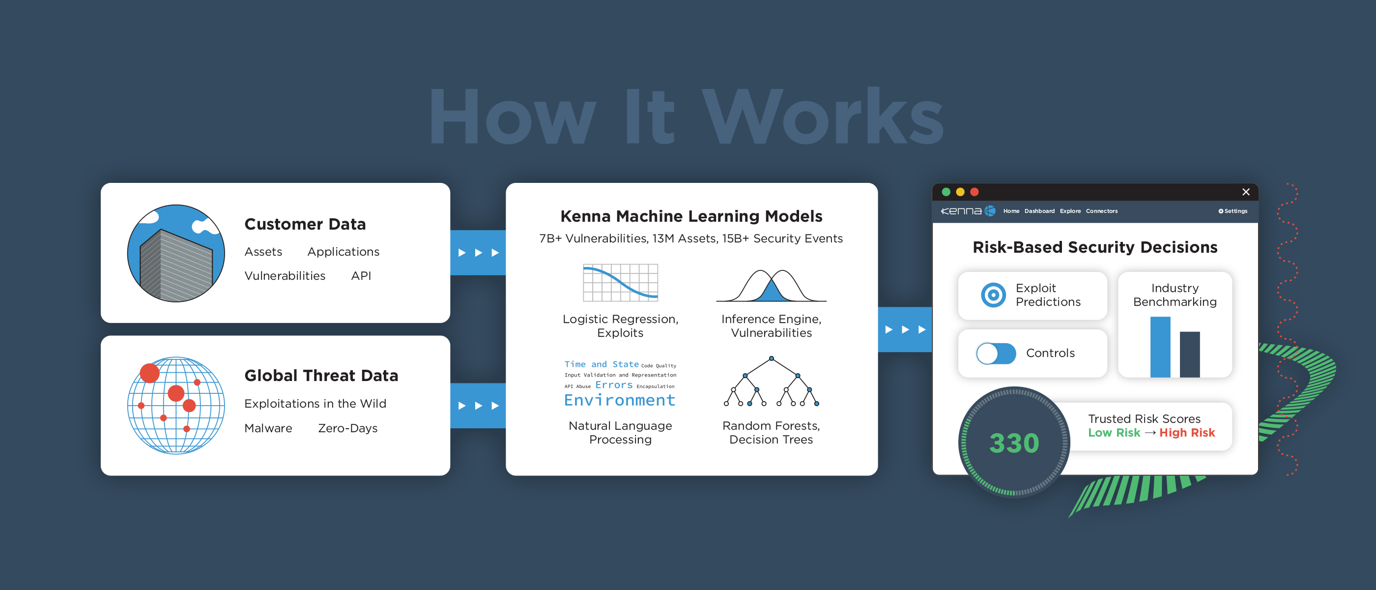
Kenna is a cyber security startup headquartered in San Francisco. Our mission is to create the best vulnerability remediation tool to protect large enterprise companies from getting hacked. Since joining my tasks included UX, design, and writing front-end code for our web application. I also helped rebrand the company including marketing collateral, whitepapers, and business cards.
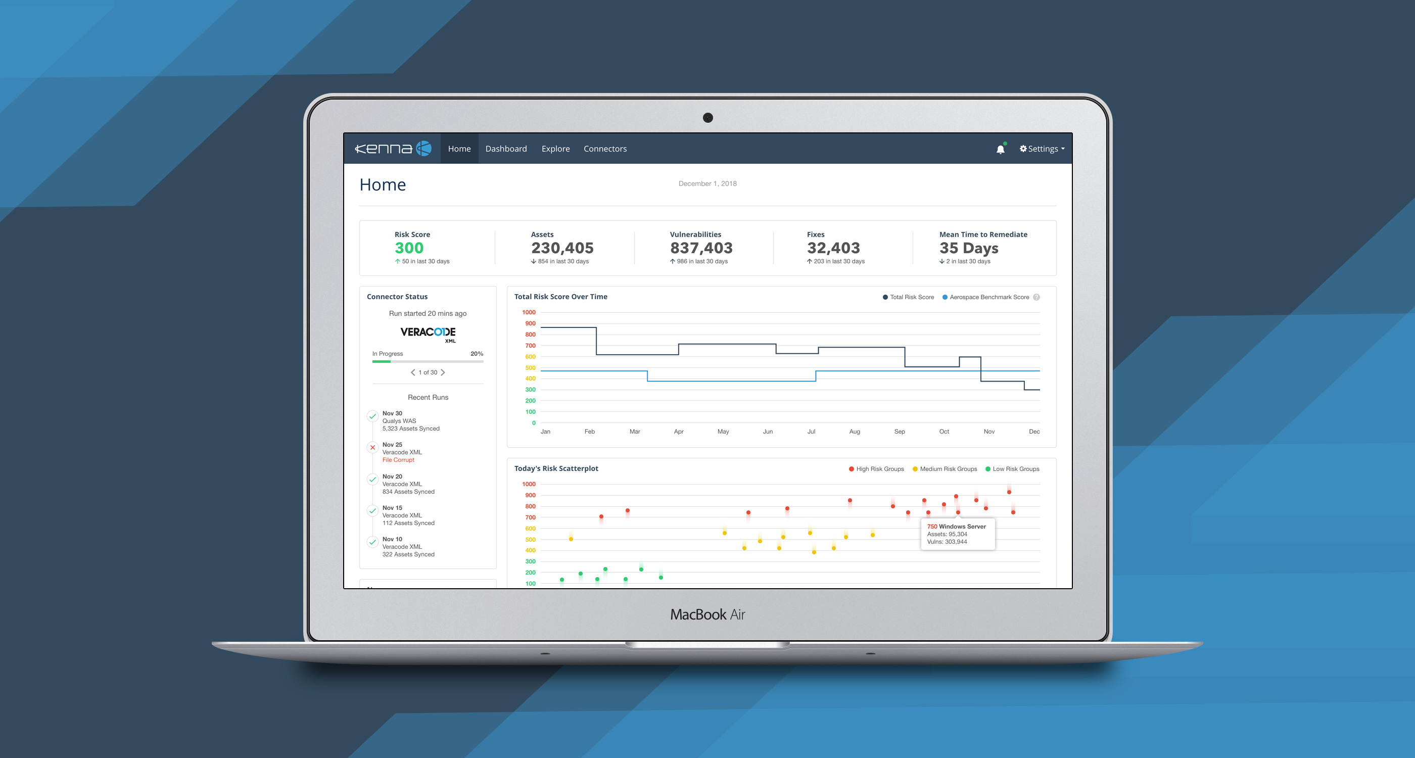
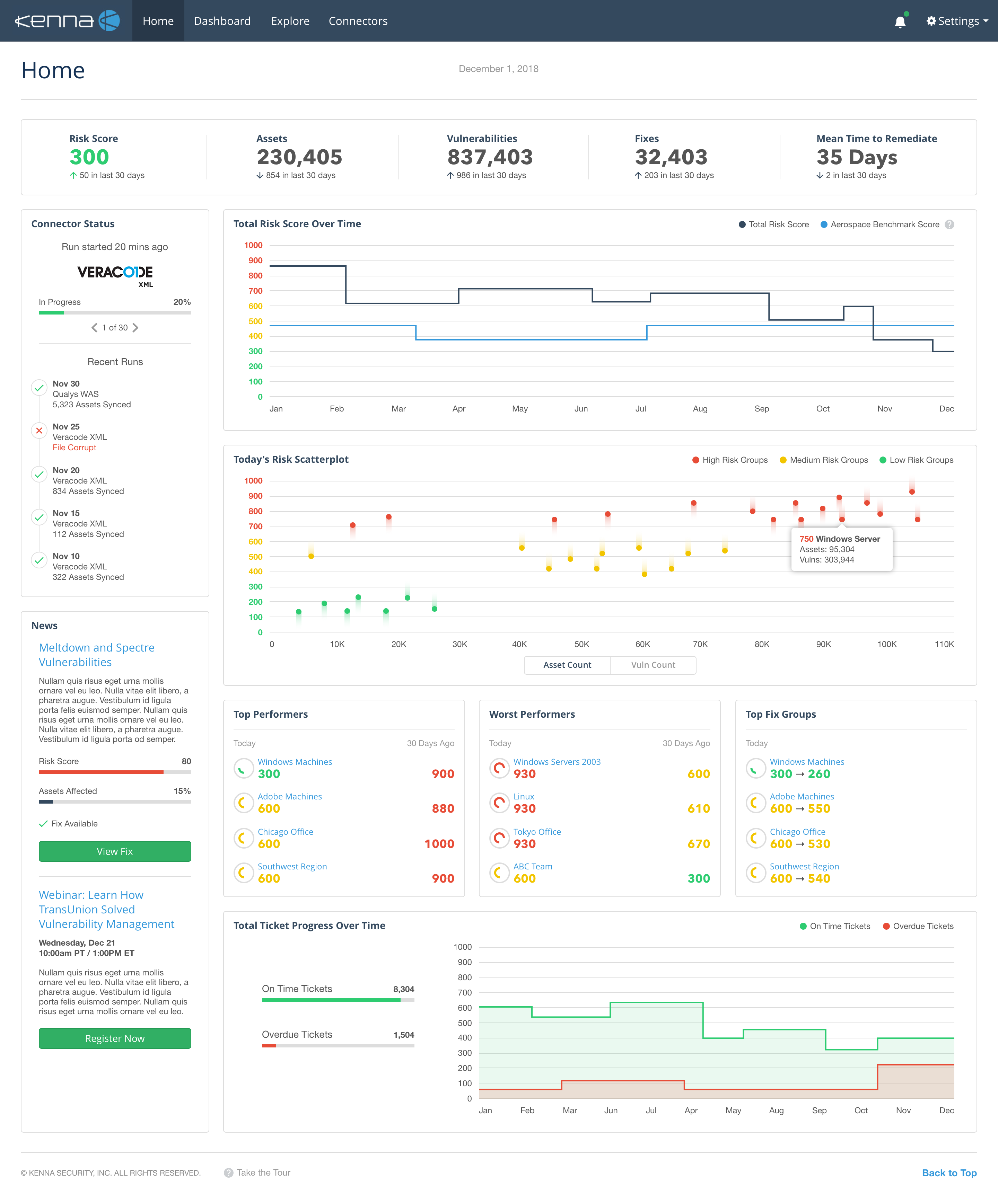
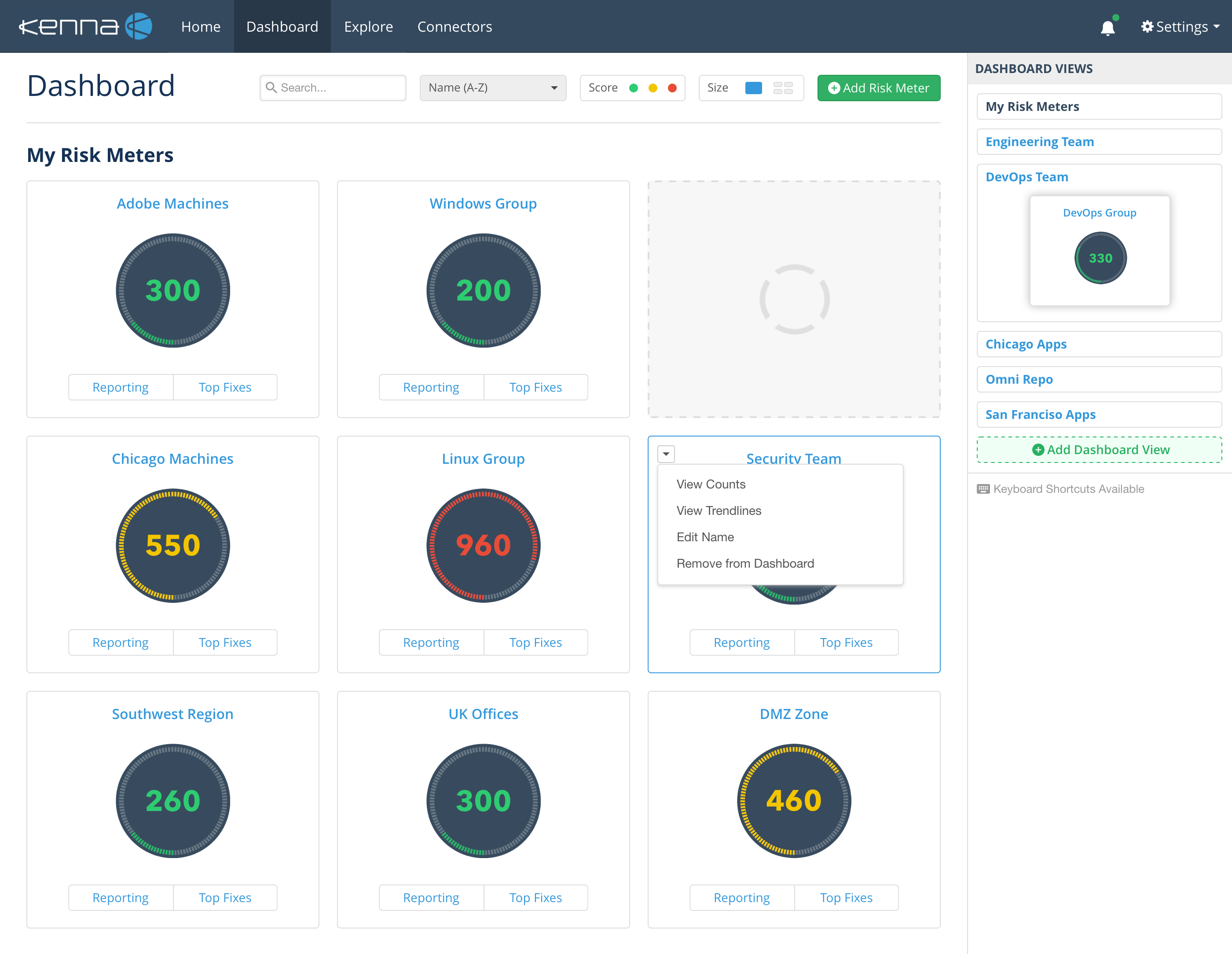
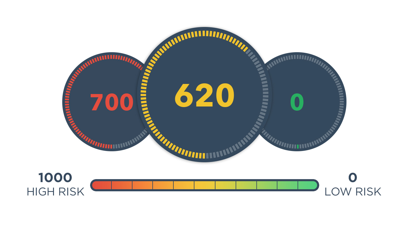
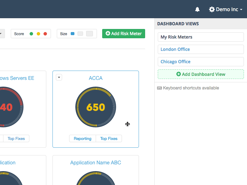
When I first joined Kenna, I didn’t know much about cyber security (all my passwords were the same — yikes), but after awhile the unfamiliar and esoteric world of security started to make sense. The computer or mobile phone you’re reading now is an asset. It’s a personal asset. Kenna protects business assets (ex. company laptops or codebases). When users import assets into our platform, we visually represent these collections as risk meters.
When users first log into the Kenna platform they're greeted with a macro-level view of their entire organization's risk posture. Early on I met with our CEO and other stakeholders to define the user problem, and I created several data vizualization concepts to share with users before hopping into UI mockups. An interesting design detail are the gradient streaks connected to each Scatterplot point. Each point visualizes a single risk meter's trend (down = lowering risk, up = increasing risk). Cumulatively these points communicate a narrative over time.
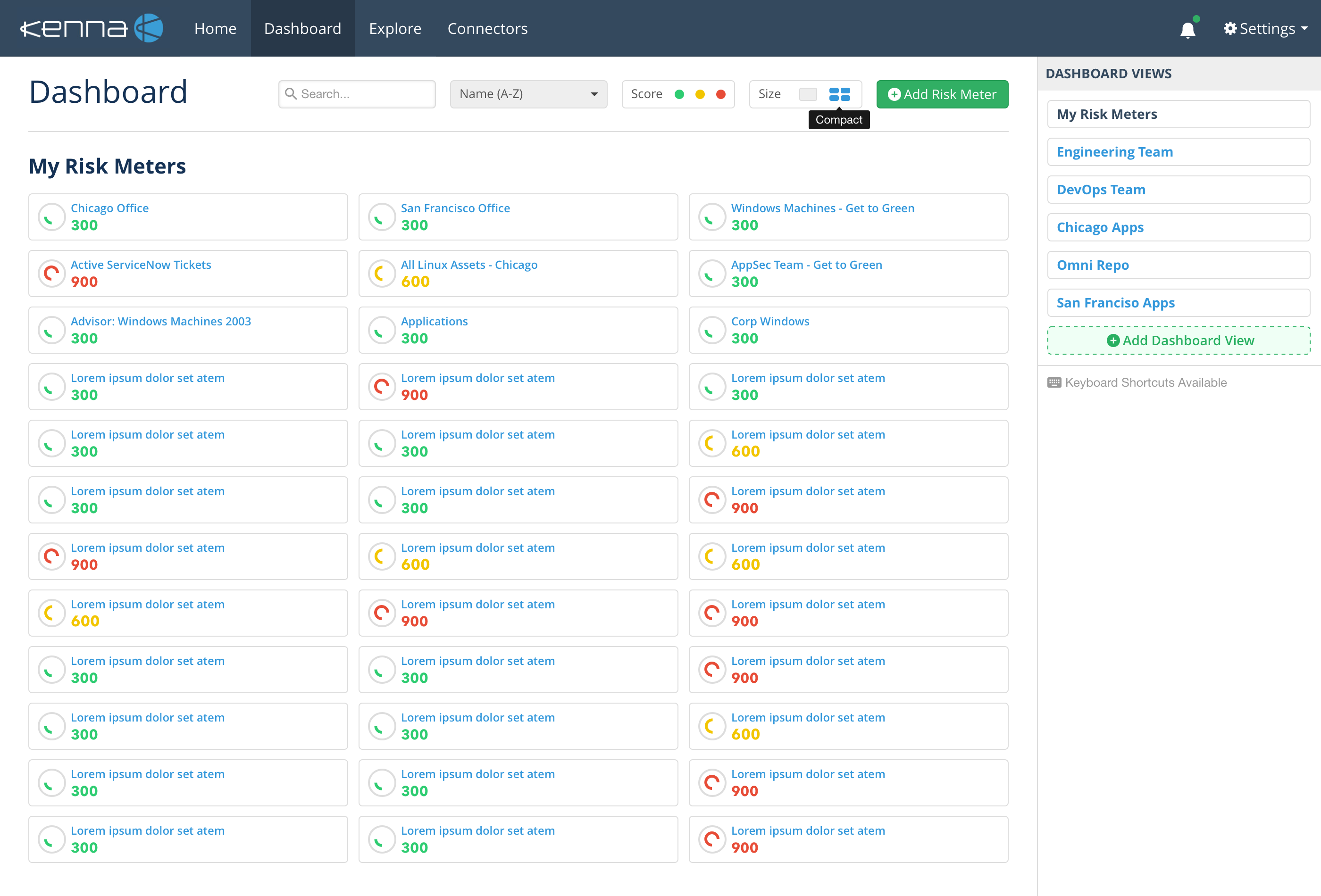
I redesigned our dashboard so users can custom sort risk meters by simply dragging & dropping. I also added live search and risk score filter functionality too. The Dashboard Views sidebar enables users to pick favorite risk meters and organize them however (ex. by geography or business units).
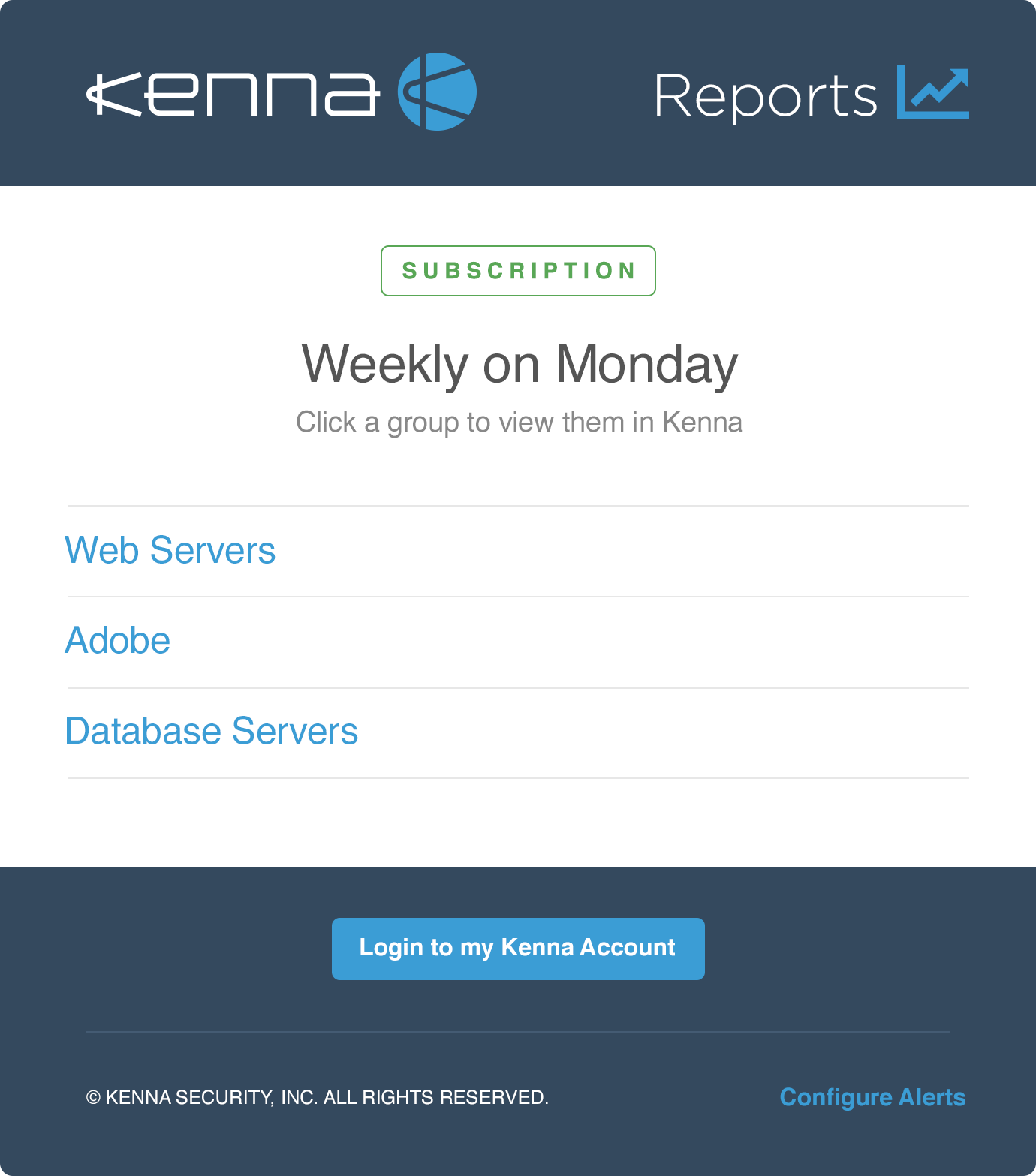
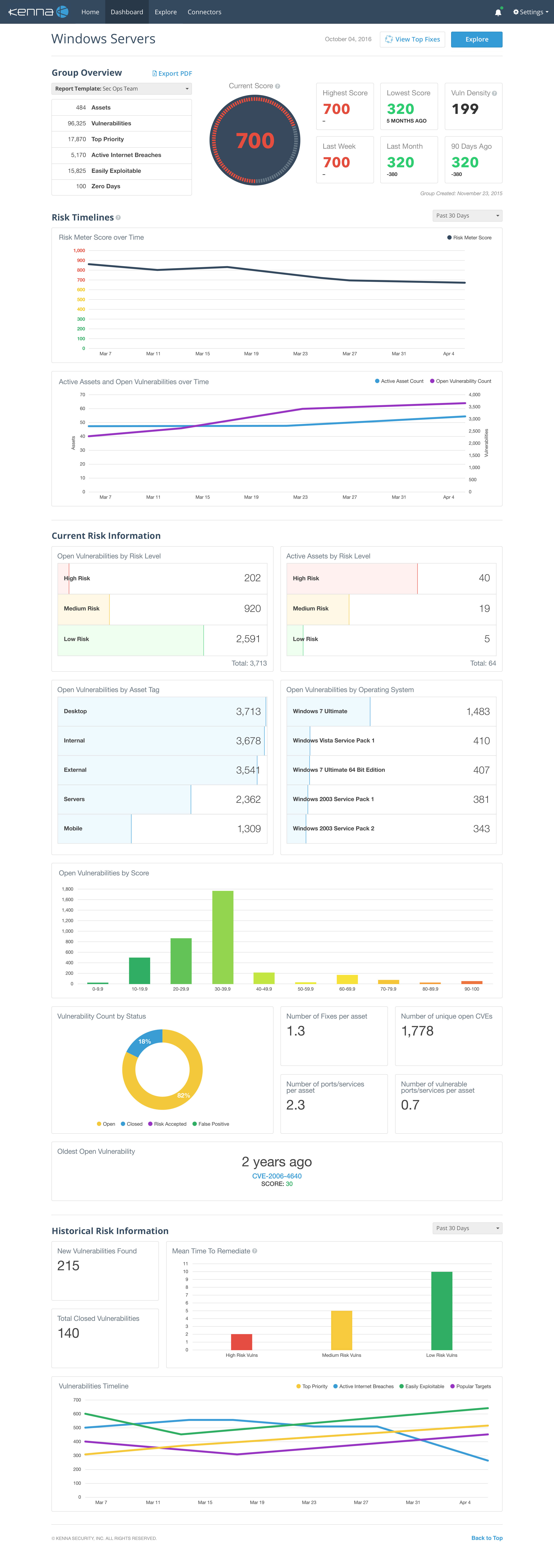
A major selling point for Kenna is our ready-made reports. I surveyed customers and discovered which data is most helpful to measure risk. We decided to create 4 sections: group overview (summary info), risk timelines (primary proof points), current risk (today's snapshot), and historical risk (past performance metrics). After launching we explored chart customization interactions and landed on a simple modal for saving a subset of charts as templates.
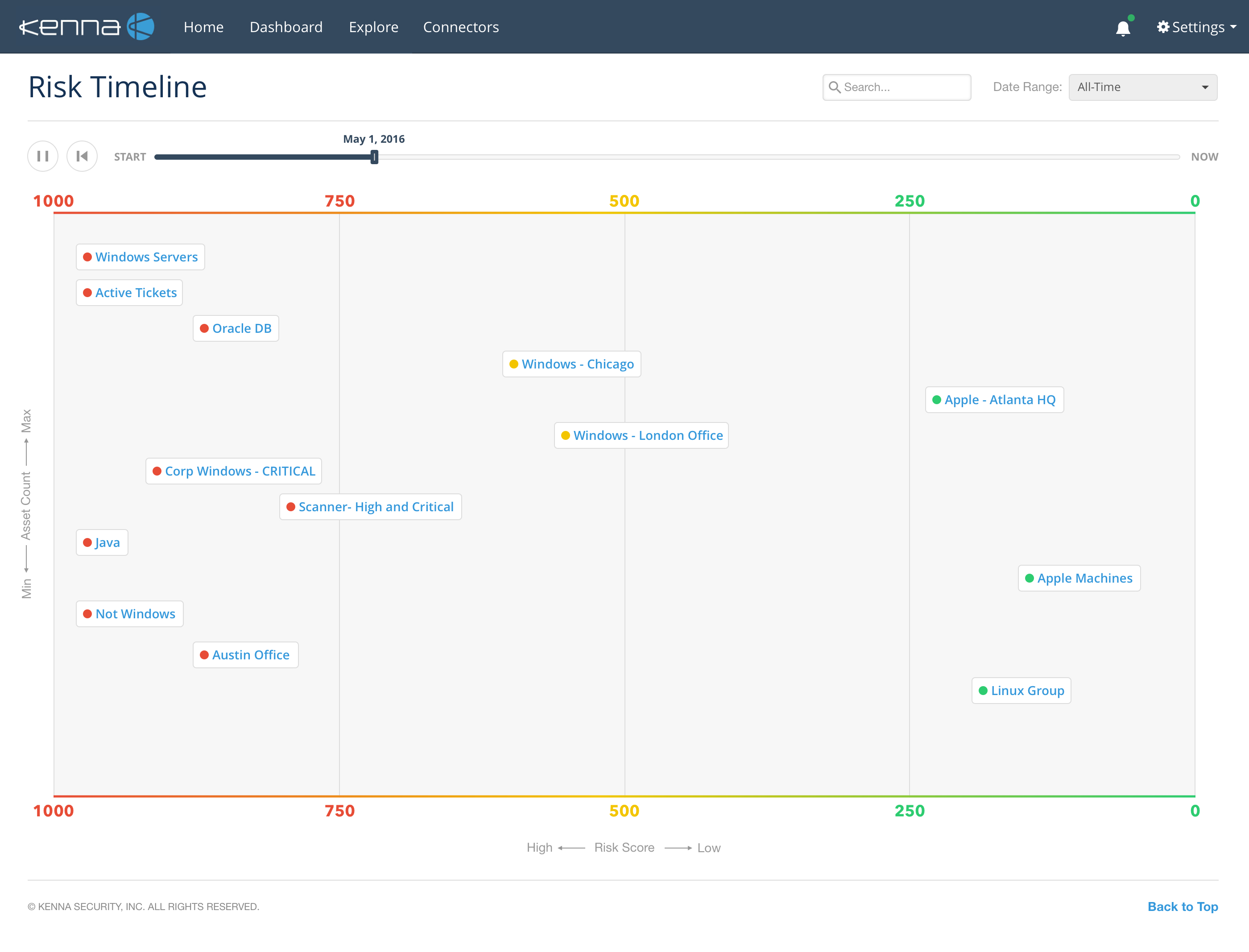
This timeline animates risk meters from the left (High Risk Zone) to the right (Low Risk Zone). This page scrolls vertically to fit all content too. It's another simple way for users to experience their cyber security impact over time.
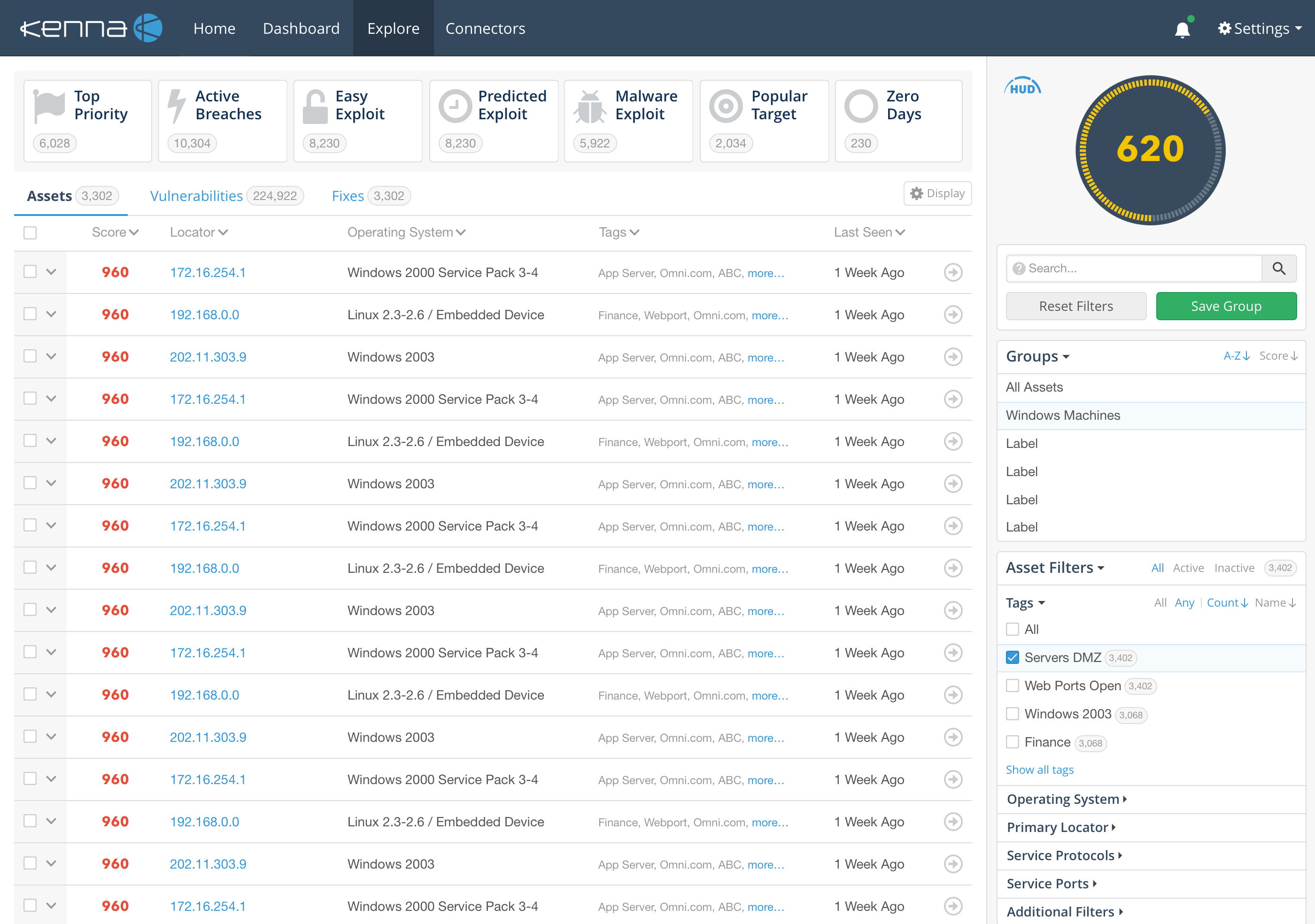
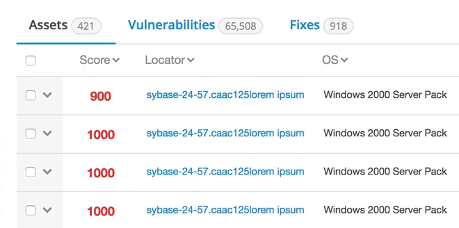
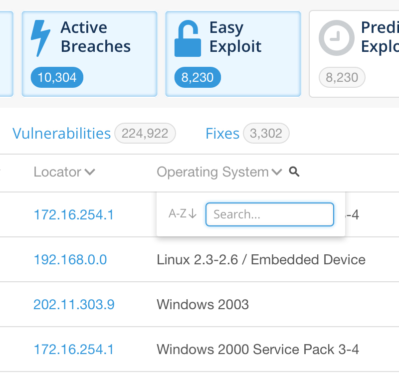
This page features all the assets, vulnerabilities, and fixes contained inside a risk meter. I refreshed the visual interface, improved several UX interactions to help users navigate around the page, and provided front-end code for the dev team.
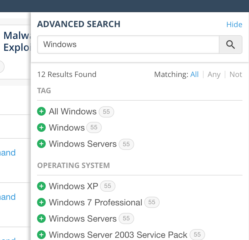
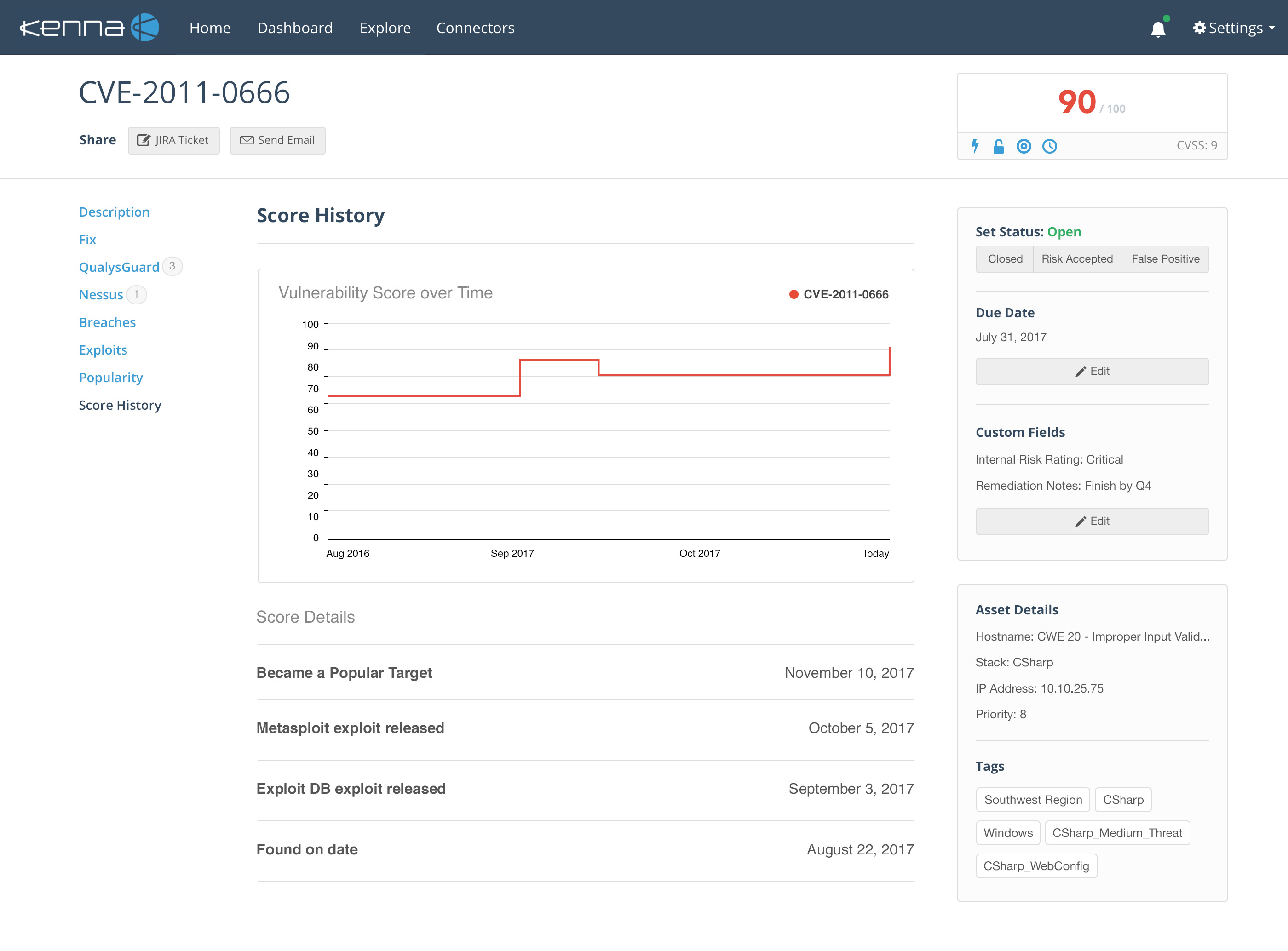
Users drill into a vulnerability from the Explore page to learn more about it. With the goal of building more trust in our data, I proposed this redesign and built a prototype to collect feedback.